TEBRA
Developing the strategic framework to merge two B2B healthcare marketing websites into a single, cohesive digital experience.

PROJECT TYPE
B2B
SAAS
Healthcare
TIMELINE
8 months
ROLE
UX Strategy
UX Design
ONE BRAND.
ONE EXPERIENCE.
ONE COHESIVE WEBSITE.
Kareo and PatientPop joined forces to create Tebra — a new brand delivering a leading end-to-end practice automation platform that enhances patient experience, supports provider well-being, and streamlines practice operations. Tebra needed a website that seamlessly wove together the two legacy brands while clearly communicating its brand story, unique value, and comprehensive offerings.
The Kareo and PatientPop websites each featured extensive product offerings with distinct user flows and strategies tailored to their audiences.
The challenge was to streamline these products and content into a scalable, SEO-driven digital experience that effectively showcased Tebra’s product value and unified brand story.
The Challenge
Audit their content
Build a scalable IA
Develop SEO-focused content strategies
Design modular pages and templates
Objectives
THE INFORMATION ARCHITECTURE
Developing the taxonomy and information architecture
I audited PatientPop and Kareo’s website content and identified what content needed to be combined, removed, and added.
From there, I created a content taxonomy to help draw and define the relationships between different content types and categories of products and services.
To get insight from users, I completed a card-sorting exercise to validate the taxonomy and identify additional opportunities.
Through identifying content gaps, I discovered content opportunities to improve the digital experience and SEO for Tebra’s users, including:
Creating tailored, audience-specific pages that explained their unique value propositions and recommended relevant products.
Creating industry pages that targeted different healthcare specialties, highlighting how they can use Tebra’s products and services.
Creating pages for each of Tebra’s primary value propositions, explaining why and how their solutions will help their customers.
Once the product offerings were finalized, I began developing the website’s sitemap.
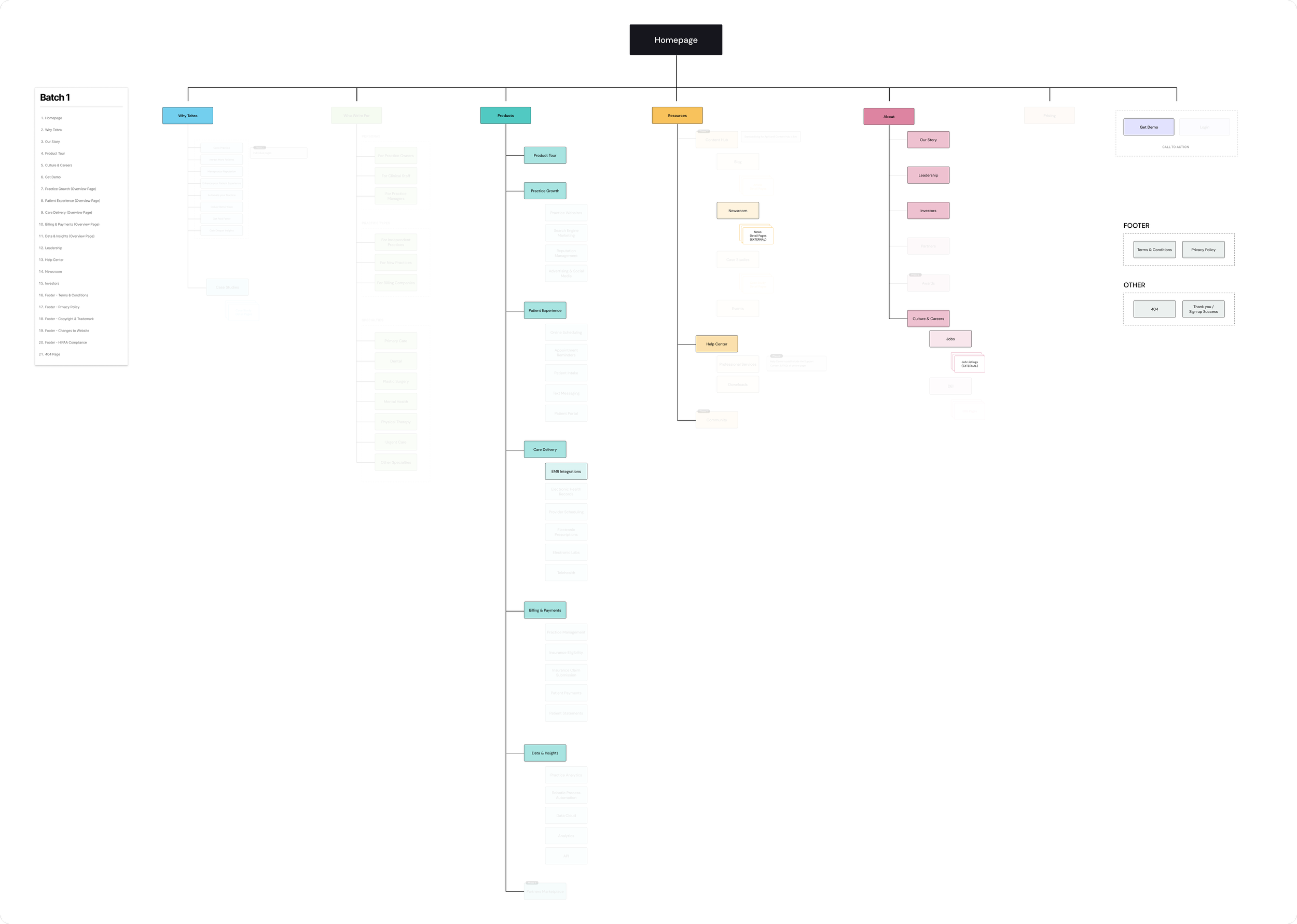
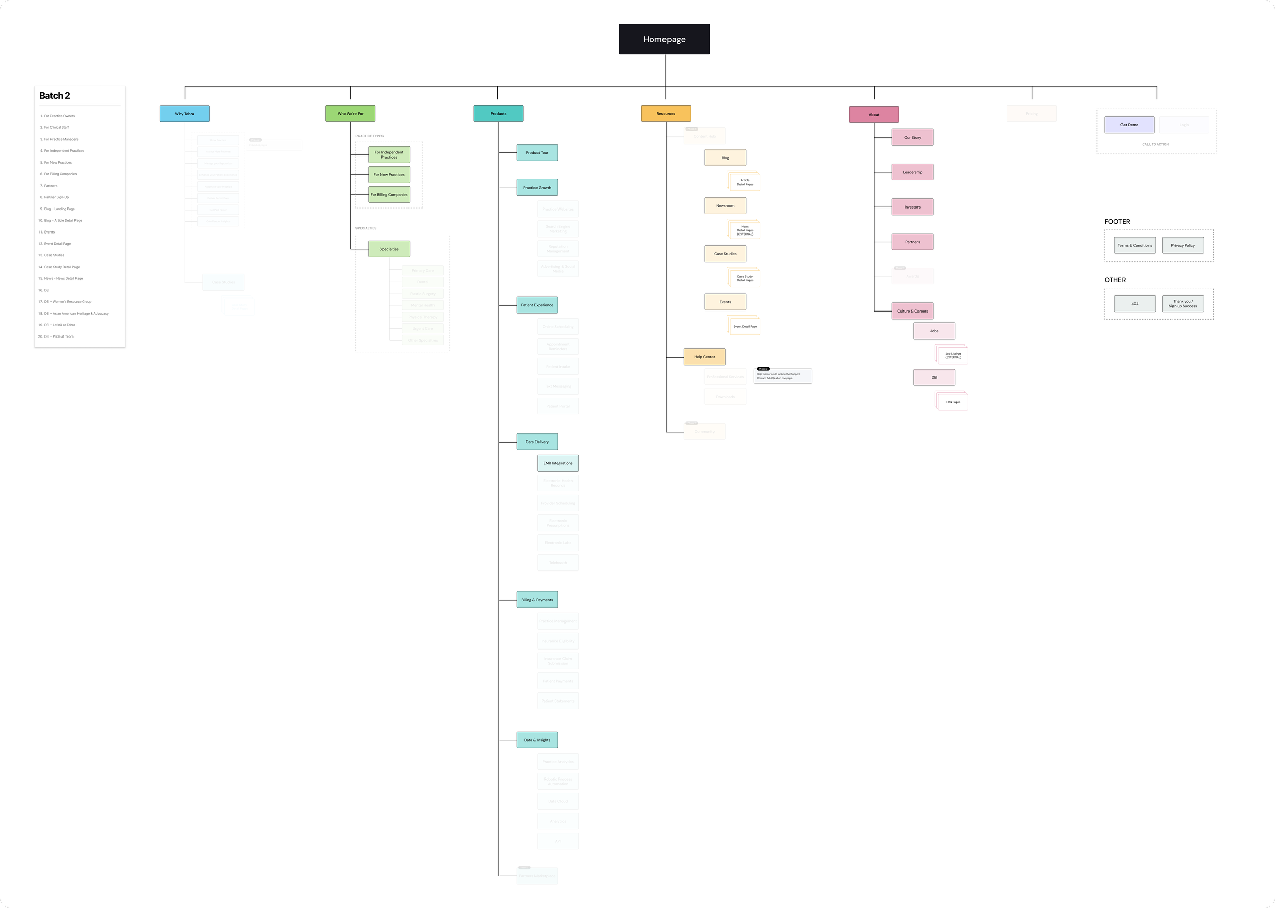
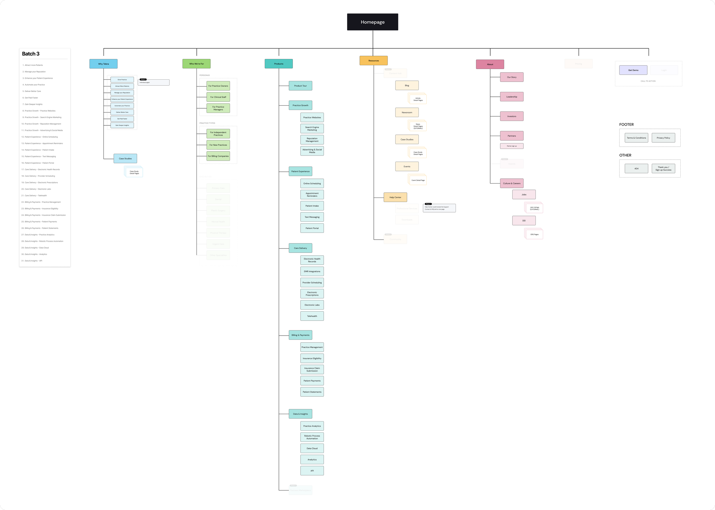
Due to the website’s size, this project required us to prioritize content into three phases of development, so I mapped out batches of content and demonstrated it visually with the sitemap.
An evolutionary sitemap
-
![]()
Phase 1
This was the MVP website. The pages included here were building blocks for the rest of the site's content and gave users introductory information about Tebra.
-
![]()
Phase 2
After our MVP was designed and developed, we began to flush out more brand-focused content - primarily "about" content and resources.
-
![]()
Phase 3
The (nearly) fully formed website. This phase added child pages to each product category and value proposition pages.
With the sitemap complete, we wanted to show how it would translate visually as the website’s navigation - and how it could accommodate a lot of pages.
We mocked up an interactive, low-fidelity navigation to demonstrate the navigation’s experience and interactions.
The final evolution
THE STRATEGY
A content-first approach
We took a content-first approach for page designs to prioritize Tebra’s brand story and champion its products - as well as optimize for SEO.
-
I translated our final sitemap into a content matrix spreadsheet to help us plan the strategy of each page and to create a resource that would help align stakeholders.
Before we began any design, we went through each page in the matrix to flush out every single detail, including:
The client lead responsible for the page
The page's description and goal
Primary and secondary conversion actions
An outline of the page's main elements
Page keywords and metadata
The relevant redirect links
The page's target audience and marketing funnel stage
-
As a part of our wireframing process, I outlined pages based on the elements noted in the matrix.
Section by section, I determined the messaging and copy to be included and organized them to create compelling a compelling story for users.
-
Content templates were generated off of the wireframes and story maps to incorporate SEO elements and guide the copywriters.
In addition to organizing the content, the template documents aided us in collaborating with and implementing client edits.
THE DESIGN
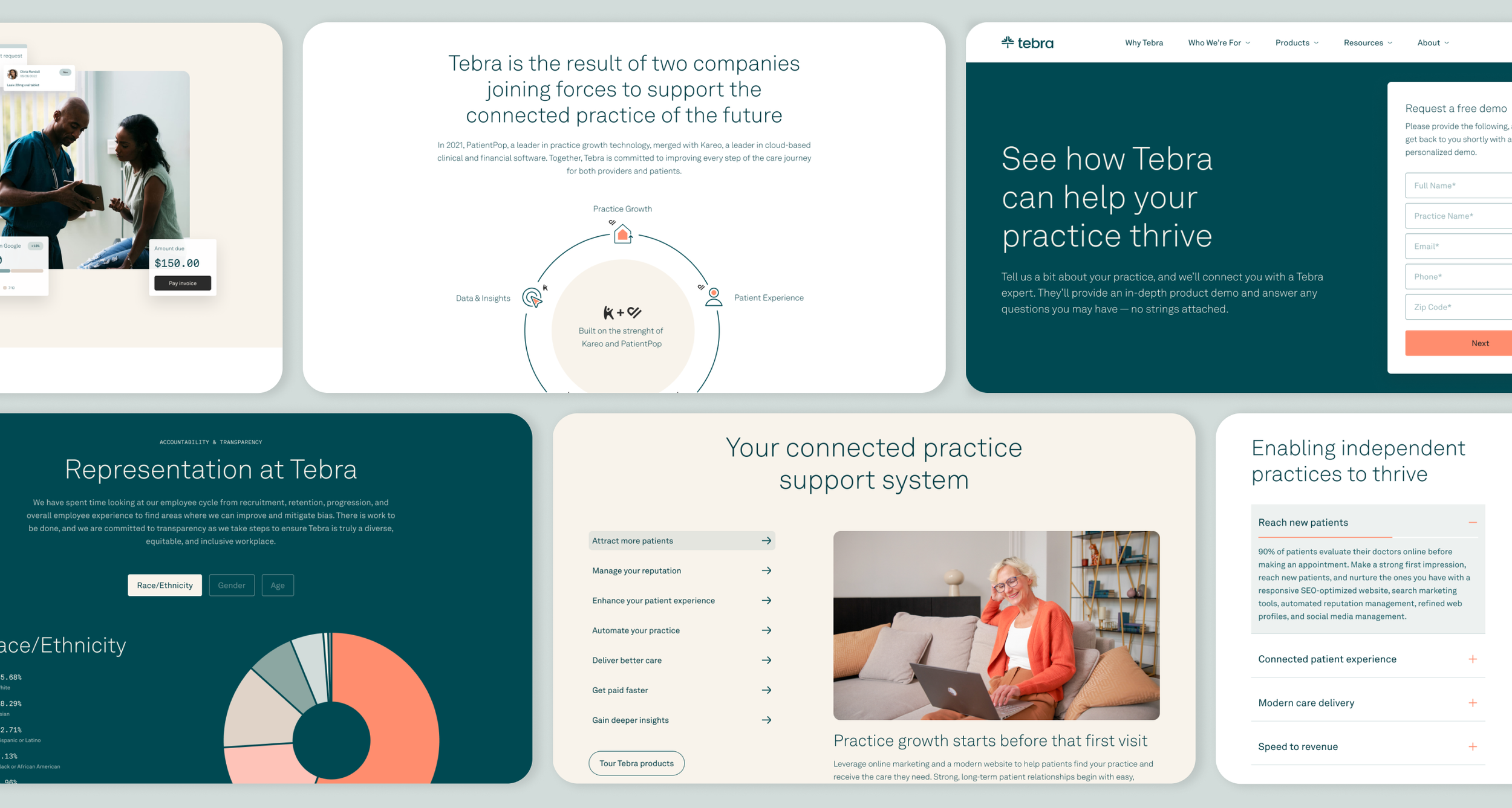
I worked closely with the UX and UI designers on the team to make Tebra’s website come to life.
We focused on designing modular components that could easily be added or removed on any of the various pages throughout the website.
Project Challenges & Learnings
Technical content and language
As a business within the B2B healthcare marketing space, Tebra’s products use industry-specific language. To lay out the strategy and design of the website, it was really important to understand the product, which meant understanding healthcare terminology and processes. Throughout the project, I often had subject matter expert meetings with the client to dive deeper into specific pages and products.
Complexity in the interim
The Kareo and PatientPop websites were extremely large with already-existing experiences users were familiar with. As we began to bring Tebra through its many phases, we had to account for and implement temporary workaround solutions that would create seamless experiences.